A brand style guide is the rulebook that makes your brand look, sound, and behave consistently across every touchpoint — from your website header to your email signature to your social media captions. Before you open a design tool or write a single guideline, run a quick brand audit. Pull every logo file you can find, list your existing colour values (HEX, RGB, CMYK), and gather three to five examples of copy that already sounds like you. That 15-minute exercise tells you what you have, what is missing, and where inconsistency has crept in.
Your 5-item starter checklist:
- Collect all logo files (SVG, EPS, PNG) and note which versions are actually in use
- Record every colour code currently appearing on your website and printed materials
- List the typefaces in use across digital and print channels
- Pull three examples of brand copy that feel “right” and three that feel “off”
- Identify who currently makes brand decisions and whether those decisions are documented anywhere
Consistent brand presentation signals professionalism and reliability to customers before they read a single word of your copy.
Key takeaways
A brand style guide is the single most cost-effective tool for protecting brand consistency at scale — and the first step is always a brand audit, not a design tool.
| Point | Details |
|---|---|
| Run a brand audit first | Collect all logo files, colour codes, and copy samples before opening any design tool. |
| Document visual and verbal systems | Capture HEX, RGB, CMYK, and Pantone values for every colour, and pair every voice trait with a real copy example. |
| Publish a living document | Web-based guides in Figma or Notion stay current; PDFs filed away do not. |
| Assign a named owner | Every guide needs a brand custodian and a quarterly review cadence to prevent drift. |
| Marketing Guardians | Offers a done-for-you brand guide build, training, and ongoing maintenance for SMBs. |
Table of Contents
- What does a complete brand style guide include?
- How do you build a brand style guide step by step?
- Which format and tools should you use to publish your guide?
- Where can you find brand style guide examples worth copying from?
- How do you share, enforce, and keep your guide current?
- What are the most common brand style guide mistakes?
- Your brand style guide checklist and sample table of contents
- How Marketing Guardians builds brand style guides for clients
- How do you tailor a brand style guide for the Canadian market?
- What are the legal considerations for branding in Canada?
- Three priorities that keep a brand style guide useful over time
- Marketing Guardians builds your brand guide, so you can focus on running your business
- Sources
- FAQ
What does a complete brand style guide include?
A well-built guide covers two parallel systems: visual and verbal. Skipping either one leaves teams working from incomplete information, which is where brand drift begins.
Visual core
Logo rules are the foundation. Document every approved variation (primary, reversed, monochrome, icon-only), define clear space as a multiple of a logo element (commonly the cap height of the wordmark), and set minimum sizes for both print and screen. Pair every rule with a misuse grid showing stretched logos, unapproved colour swaps, and low-contrast placements — these “don’ts” prevent the most common implementation errors far more effectively than correct examples alone.
Colour palette documentation needs exact values across every colour model your teams use. The table below shows the minimum data to capture per colour.
Usage ratios matter as much as the values themselves.
Typography documentation should name each typeface, its weights, and its intended use (display, body, caption). Always include web-safe fallbacks and specify whether you are serving webfonts via Google Fonts, Adobe Fonts, or a self-hosted option, because a designer who cannot access your primary typeface will substitute something that erodes consistency.
Verbal core
The verbal system is where many guides fall short. Document your brand story in two to three sentences, then define three to five voice traits with concrete examples. “Confident” is not a voice trait until you show a sentence written confidently beside the same sentence written tentatively. Add a short word list: terms you always use, terms you never use, and terms that require specific context.
Supporting systems and accessibility
Beyond logo and colour, a thorough guide addresses imagery style (photography direction, illustration treatment, iconography grid), layout principles, and, where relevant, UI component behaviour and animation timing.
Accessibility checkpoints belong in every guide as a non-optional section. Document minimum contrast ratios per WCAG 2.1 AA (4.5:1 for normal text, 3:1 for large text), alt-text writing conventions, and minimum type sizes for digital and print. These are not edge-case considerations for Canadian brands — the Accessible Canada Act (S.C. 2019, c. 10) sets a federal accessibility standard that affects any federally regulated organisation.
File format guidance: distribute logos as SVG for web (resolution-independent), EPS for print production, and PNG with transparent backgrounds for general use. Webfonts should ship with a system-font fallback stack so layouts do not break when a font fails to load.
Pro Tip: Set a colour-contrast checker like the WebAIM Contrast Checker as a required step in your design review process. Catching a failing ratio before launch is far cheaper than retrofitting it after.
How do you build a brand style guide step by step?
Adobe recommends starting with logo, colour, and type before expanding into voice and supporting assets — a practical sequence that lets you ship a usable version 1 without waiting for every decision to be made.
- Audit existing assets (Owner: founder or brand lead | Time: 2–4 hours) — Gather every logo file, colour swatch, font file, and copy sample in use. Note inconsistencies. This step reveals the real scope of the project.
- Define brand strategy inputs (Owner: founder + copywriter | Time: 4–8 hours) — Confirm mission, values, positioning, and audience. These decisions drive every visual and verbal choice downstream. If they are not documented, document them now before touching design.
- Make core visual decisions (Owner: designer | Time: 8–16 hours for a small team; 2–4 weeks agency-supported) — Choose or refine the logo, lock the colour palette with full values, and set the type scale. For a solo founder, this is the stage where hiring a designer for even a half-day session pays for itself.
- Define voice and tone (Owner: copywriter or content lead | Time: 4–8 hours) — Write voice traits with paired examples, build the word list, and draft tone-of-voice guidelines for at least three contexts (social, long-form, customer service).
- Compile and design the guide (Owner: designer + brand lead | Time: 8–24 hours depending on format) — Assemble all decisions into a single document. Include the misuse grid. Add file-download links for approved assets.
- Review and approve version 1 (Owner: brand lead + one cross-functional reviewer | Time: 2–4 hours) — Check that every rule has an example, every colour has all four values, and every section has a named owner for future updates.
- Publish and distribute (Owner: brand lead | Time: 1–2 hours) — Share via the agreed channel (see Section 4). Brief the team. Set a calendar reminder for a 90-day review.
- Maintain and version (Owner: brand custodian | Cadence: quarterly or on trigger) — Log every change in a changelog. Treat the guide as a living document, not a finished artefact.
Typical cost signals: a solo founder using Figma Community templates and Adobe Express can build a functional version 1 for under $500 CAD in tool costs. A small team working with a freelance designer typically invests $2,000–$6,000 CAD. An agency-supported build with full strategy, design, and training runs higher depending on scope.
Version 1 go-live checklist:
- Logo rules with misuse examples documented
- Full colour palette with HEX, RGB, CMYK, and Pantone values
- Typography with web fallbacks named
- Three to five voice traits with paired examples
- At least one accessibility checkpoint (contrast ratio)
- Named owner and review date recorded
Which format and tools should you use to publish your guide?
The format you choose determines whether your guide gets used or ignored. A PDF filed in a shared drive is a guide that no one updates. A living web document linked from your team’s daily tools is one that actually shapes decisions.
Format comparison:
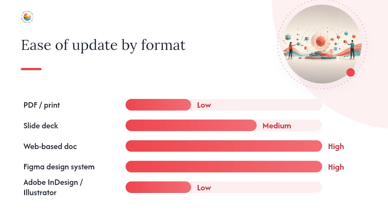
| Format | Cost | Ease of update | Best for | Maintenance effort |
|---|---|---|---|---|
| PDF / print | Low | Low | External partners, print handoffs | High (manual re-export) |
| Slide deck (Google Slides / PowerPoint) | Low | Medium | Small teams, quick sharing | Medium |
| Web-based doc (Notion, Confluence) | Low–medium | High | Growing teams, living docs | Low |
| Figma design system | Medium | High | Product and design teams | Low–medium |
| Adobe InDesign / Illustrator | Medium | Low | Print-heavy brands, agency output | High |
Tool recommendations for Canadian teams:
- Figma is the strongest choice for teams that produce digital products. Its collaborative, living-document approach means designers, strategists, and copywriters can all contribute and review in one place. Figma Community has free brand guideline templates you can fork immediately.
- Adobe Creative Cloud (InDesign for layout, Illustrator for logo work, Photoshop for imagery) remains the standard for print-heavy brands and agency-produced guides. Adobe Creative Cloud for Teams is available through Adobe Canada with Canadian pricing.
- Notion or Confluence work well as the “home base” for the verbal sections of a guide — voice, tone, word lists, and writing rules — especially when the design system lives in Figma and the two need to link.
- HubSpot’s brand guidelines examples article is a useful reference for seeing how other brands structure their web-based guides before you commit to a format.
Selection criteria to consider before choosing:
- How often will the guide need updating? (Monthly = web doc; annually = PDF is fine)
- Who needs access? (External vendors need a shareable link or PDF, not a Figma file)
- Does your team already use a design system? (If yes, extend it rather than building a parallel document)
- What is your access-control requirement? (Sensitive brand assets may need permission-gated hosting)
Pro Tip: Publish a “quick reference” one-pager alongside the full guide. Most team members need the colour codes and logo download link, not the full 40-page document. A one-pager gets used daily; the full guide gets consulted for edge cases.
Where can you find brand style guide examples worth copying from?
The fastest way to raise the quality of your own guide is to study guides that are already working. HubSpot’s curated gallery of brand style guide examples is one of the most practical starting points available — it covers a wide range of industries and guide formats, from minimal one-pagers to full design system documentation.
The BrandingStyleGuides archive on YouTube is a less obvious but genuinely useful resource: it collects video walkthroughs of real brand guidelines, which lets you see how practitioners explain their own rules, not just what the rules look like on a page.
Five concrete patterns worth copying from strong guides:
- Misuse grids placed directly beside the correct usage rule. Seeing a stretched logo next to the correct version is more instructive than a paragraph of text.
- Downloadable asset packs linked from within the guide itself, so designers never have to ask where the approved files live.
- Voice snippets in context — showing the same message written in three different tones (formal, casual, urgent) so writers understand how the voice flexes without breaking.
- Colour usage ratios expressed as a visual diagram, not just a list of swatches, so teams understand proportion at a glance.
- Pattern libraries for UI components (buttons, cards, form fields) that show how brand colours and type apply to real interface elements.
How to evaluate an example quickly: check whether every rule has a paired example, whether the guide is clearly dated or versioned, whether accessibility is addressed, and whether the document is structured so a new team member could use it without a briefing. A guide that requires explanation to use is a guide that will not be used.
When you adapt a pattern from an example, copy the structure and the reasoning, not the visual style. The goal is to understand why a section is organised the way it is, then apply that logic to your own brand decisions.
How do you share, enforce, and keep your guide current?
A guide that lives in one person’s Downloads folder is not a guide — it is a document. Distribution and governance are what turn a document into a working system.
Ownership model: assign a brand custodian (typically the marketing lead or a senior designer) who owns the guide and approves changes. For teams of five or more, add a lightweight review committee — one representative from design, one from content, and one from product or operations — that meets quarterly to assess whether the guide still reflects how the brand is actually being used.
Distribution channels:
- Pin the guide link in your team’s primary communication tool (Slack, Teams, or your project management platform)
- Add it to your onboarding checklist so every new hire encounters it in their first week
- Share a read-only version with external vendors and agencies at the start of every project
- Connect the design system version to your product repository if your team uses one
Versioning and update triggers: number every release (v1.0, v1.1, v2.0) and maintain a changelog that records what changed, why, and when. Common update triggers include a rebrand or visual refresh, a new product line or market expansion, a legal or trademark change, and feedback from teams that a rule is unclear or missing.
Brands that present a unified identity across touchpoints are perceived as more professional and stable — and a well-maintained guide is the mechanism that makes that consistency possible at scale. Brand guidelines save time and money by reducing rework, speeding approvals, and protecting brand equity as teams grow.
Adoption metrics to track: asset download counts from your hosted guide, reduction in “which logo should I use?” questions to the design team, and time saved in creative review cycles. These are practical signals that the guide is working.
Pro Tip: Instead of policing brand usage after the fact, build a short “brand check” step into your existing content approval workflow. One question — “Does this asset follow the guide?” — catches most issues before they go live, without creating a separate enforcement process.
What are the most common brand style guide mistakes?
Most brand drift does not happen because people ignore the guide. It happens because the guide made it too easy to guess wrong.
Dos and don’ts:
- Do pair every rule with a visual example. A rule that says “use the logo with 20px clear space” means nothing without a diagram.
- Don’t write rules so rigid that they cannot accommodate real-world use cases. A guide that forbids every logo variation will be quietly ignored when a vendor needs a version that fits their template.
- Do include a misuse grid showing incorrect applications. This is one of the most skipped sections and one of the most effective.
- Don’t bury the guide in a folder no one checks. If it takes more than two clicks to find, it will not be found.
- Do address accessibility from the start. Adding it later means retrofitting decisions that were already made without it.
- Don’t treat version 1 as the final word. A guide that never changes is a guide that no longer reflects the brand.
- Do write voice guidelines with real copy examples, not abstract adjectives. “Warm” and “professional” describe almost every brand — show what those traits look like in an actual sentence.
Quick remedies: if a rule is too vague, add a paired example and a counter-example. If the guide is hard to find, add a pinned link in Slack and a bookmark in your browser bar. If misuse examples are missing, spend two hours building a “what not to do” page — it is the highest-ROI addition you can make to an existing guide.
Your brand style guide checklist and sample table of contents
Use this as a starting template. Paste it into Notion, duplicate it in Figma, or drop it into a Google Doc and fill it in.
Version 1 must-haves vs. add-later items:
- Must have: Logo (primary + reversed + icon-only), colour palette with full values, primary typeface with web fallback, three to five voice traits with examples, one misuse grid, named owner and review date
- Add later: Secondary typefaces, extended colour palette, illustration style, iconography library, animation principles, full UI component library, photography art direction, detailed tone-of-voice guide by channel
Sample table of contents:
| Chapter | Description |
|---|---|
| 1. Brand overview | Mission, values, positioning, and audience in two to three sentences each |
| 2. Logo | All variations, clear space rules, minimum sizes, and misuse grid |
| 3. Colour palette | Full values (HEX, RGB, CMYK, Pantone), usage ratios, and accessibility contrast notes |
| 4. Typography | Typefaces, weights, scale, web fallbacks, and usage rules |
| 5. Voice and tone | Brand story, voice traits with examples, word list, and tone by context |
| 6. Imagery | Photography direction, illustration style, and iconography grid |
| 7. Accessibility | Contrast ratios, alt-text conventions, and minimum type sizes |
| 8. Asset downloads | Links to approved logo files, font files, and colour swatches |
| 9. Changelog | Version history with dates and change summaries |
Where to find starter templates: Figma Community has free brand guideline templates searchable by “brand guidelines” or “style guide.” Adobe Express offers a guided brand kit builder. Notion’s template gallery includes brand wiki starters. For visual inspiration and practical layouts, the tips for developing your brand’s wow factor resource offers useful direction on what makes brand assets memorable.
How Marketing Guardians builds brand style guides for clients
Our process follows a six-stage model: discovery, assets audit, strategy, design, delivery, and training with ongoing maintenance. Discovery surfaces the brand decisions that have already been made (even informally) and the gaps that need filling. The assets audit mirrors the starter checklist above but goes deeper — we look at every touchpoint a customer encounters, from Google Ads creative to email footers, and flag inconsistencies before a single new asset is designed.
The signals that suggest a business should outsource this work are fairly consistent: limited internal design resources, a rebrand or product launch with a hard deadline, a need to align marketing execution with a new brand direction simultaneously, or a history of inconsistent creative output across channels. When any of those conditions are present, the cost of building the guide internally typically exceeds the cost of hiring help, once rework and decision-making time are factored in.
For SMBs, the building a strong brand process also needs to account for bilingual considerations, regional market differences, and compliance with Canadian accessibility standards — factors that a generic template cannot address. Marketing Guardians works with clients across Canada to build guides that are production-ready from day one, with asset libraries, training for internal teams, and a maintenance plan built into the engagement.
Outcome signals we track for clients include reduced creative rework, faster approval cycles, and improved consistency scores in brand audits conducted three to six months after launch. The marketing collateral design work we do for clients is grounded in the same guide we build with them, so every deliverable reinforces the system rather than working around it.
How do you tailor a brand style guide for the Canadian market?
Canada’s market is not a single audience — it is a set of regional and cultural contexts that a brand guide needs to acknowledge explicitly if the brand operates across more than one province.
The most immediate consideration is bilingualism. The Official Languages Act (R.S.C. 1985, c. 31) requires federally regulated businesses to communicate in both English and French.
Regional cultural nuances are worth a brief note in the guide’s brand story section. A brand that resonates strongly in Toronto may need different imagery direction for Quebec or British Columbia — not a different identity, but a different emphasis in photography, spokesperson representation, and seasonal references. Documenting these as “regional application notes” within the imagery chapter keeps the core guide unified while giving regional teams the guidance they need.
Metric and format conventions also differ from the United States. Canadian brand guides should specify metric units (centimetres, not inches) for print specifications, Canadian date formatting (YYYY-MM-DD in formal contexts, or “March 12, 2025” in editorial), and Canadian spelling conventions (colour, not color; organise, not organize) in the writing guidelines section.
What are the legal considerations for branding in Canada?
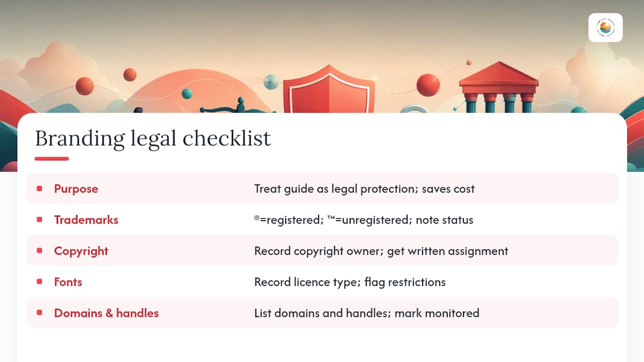
A brand style guide is also a legal protection document, and treating it that way from the start saves significant cost later.
Trademark usage guidelines should be included in every guide. Once a trademark is registered with the Canadian Intellectual Property Office (CIPO), the ® symbol may be used. Unregistered marks use ™. The guide should specify which marks are registered, which are pending, and how each symbol appears in relation to the wordmark. Misuse of ® on an unregistered mark is a violation of the Trademarks Act (R.S.C. 1985, c. T-13).
Copyright in brand assets is a related consideration. The guide should note who owns the copyright in each asset (the business, a contracted designer, or a licensed stock provider), because this affects how assets can be used, modified, and sublicensed to partners. Work created by employees is typically owned by the employer under Canadian copyright law; work created by independent contractors requires an explicit written assignment of copyright.
Font licensing is frequently overlooked. A typeface licensed for desktop use is not automatically licensed for web embedding, app use, or broadcast. The guide should record the licence type for each font and flag any restrictions, so teams do not inadvertently violate a licence by embedding a font in a product or video.
Domain and social handle documentation within the guide protects against brand squatting. Record every approved handle and domain variant, and note which are actively monitored. This is particularly relevant for Canadian brands expanding into new platforms or markets.
This section provides general information about Canadian branding law and is not a substitute for legal advice. Confirm current trademark and copyright requirements with a qualified Canadian intellectual property lawyer.
Three priorities that keep a brand style guide useful over time
Most guides fail not at launch but at month six, when the team has grown, the product has evolved, and no one has updated the document. Three priorities prevent that outcome.
Start small and ship. A guide with five well-documented rules that the team actually follows is more valuable than a 60-page document that sits unread. The verbal and visual core — logo, colour, type, and three voice traits — is enough to align a team and protect consistency. Everything else can be added in subsequent versions.
Document misuse before it happens. The most instructive section of any guide is the one that shows what not to do. Building a misuse grid in version 1, even with just four or five examples, prevents the errors that are most likely to occur and most damaging when they do. Teams rarely misuse a brand intentionally; they misuse it because no one showed them the boundary.
Treat the guide as a living system, not a finished product. Figma’s guidance on style guides frames this well: the guide should evolve with the brand, involve cross-functional contributors, and be reviewed on a regular cadence. A quarterly review takes two hours and prevents the kind of drift that requires a full rebrand to fix.
The balance between clarity and flexibility is the hardest thing to get right. Rules tight enough to prevent drift but flexible enough to accommodate real-world use cases — that tension is what separates a guide that gets used from one that gets ignored.
Marketing Guardians builds your brand guide, so you can focus on running your business
Building a brand style guide from scratch takes time, design skill, and strategic clarity that most small business owners and lean marketing teams simply do not have available on top of their existing workload. Marketing Guardians offers a done-for-you approach: we audit your existing assets, build a living brand guide tailored to your business and the Canadian market, train your team on how to use it, and maintain it as your brand evolves.

Our subscription model means you get ongoing brand and marketing support without a long-term agency contract or the overhead of a full-time hire. Whether you need a complete brand guide built from the ground up or an existing guide updated and enforced across your social media management and content channels, we handle the execution. Canadian SMBs looking for a practical, market-ready starting point can explore our digital marketing services and request a consultation to see what a first engagement looks like.
Sources
- Why You Need Brand Guidelines + 3 Easy Steps to Create Them | Adobe
- What is a style guide and how to create one?
- What Is a Brand Style Guide? Full Guide · Zepixo
- How to create a brand style guide from scratch: a step-by-step walkthrough
FAQ
What is a brand style guide?
A brand style guide is a documented rulebook that defines how a brand looks, sounds, and behaves across every channel — covering logo usage, colour palette values, typography, voice and tone, and imagery direction so teams produce consistent work without guessing.
How do you create a style guide for your brand?
Start with a brand audit to collect existing assets, then lock the visual core (logo, colour, type) before moving to voice and supporting systems. Adobe recommends this three-step sequence as the most practical route to a usable first version.
What are the 5 C’s of branding?
Definitions of the “5 C’s of branding” vary across sources and no single canonical framework is universally agreed upon. A common version covers clarity, consistency, content, connection, and community — but confirm which framework your team is referencing before building strategy around it.
What are the 7 pillars of branding?
The “7 pillars of branding” is a descriptive label used differently across practitioners. Common versions include purpose, positioning, personality, perception, promotion, presence, and performance — though the specific list depends on the source. Use it as a checklist prompt, not a fixed standard.
Why does brand consistency matter for businesses?
Consistent brand presentation signals professionalism and reliability to customers, which builds trust over time. For Canadian businesses operating across multiple provinces or in both official languages, a documented brand style guide also reduces the risk of inconsistent bilingual execution and regional misrepresentation.
Recommended

AI search is changing fast. Download our Playbook to make sure you keep up.
Inside our AI Search and GEO Playbook, you’ll find a readiness checklist and a few copy-and-paste building blocks:
- Add Organization, Person, and Service schema to your About and Services pages.
- Add a short FAQ to your top service page with two or three real customer questions.
Small changes like these help AI systems understand who you are, what you do, and when to reference you.
Where to start if you feel behind? Just begin with one page - one question - one clear answer. Then open the Playbook and pick the next small step. Consistency beats intensity here. Your future self will be glad you started this month.


